Landing pages are often the first online point of interaction between a potential customer and a brand. Their main goal is to convert visitors into leads or customers. A well-designed landing page positively impacts conversion rates, making it an indispensable tool in achieving marketing goals. This is where landing page wireframing comes in.
Wireframing is the blueprint of the future landing page. It allows stakeholders to refine its elements before moving on to more detailed design and development stages. It also ensures that the final landing page is both user-friendly and effective in driving conversions.
Keep reading to discover the best practices for building and customizing wireframes. We've also included some templates and examples that you can use to craft your own wireframes. Now, let’s delve deeper into the subject.
What is a landing page wireframe, and why is it important?
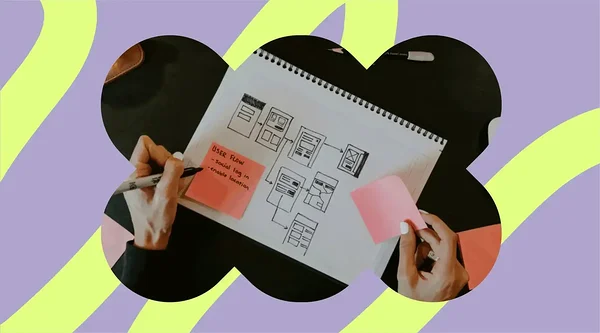
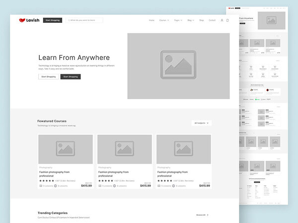
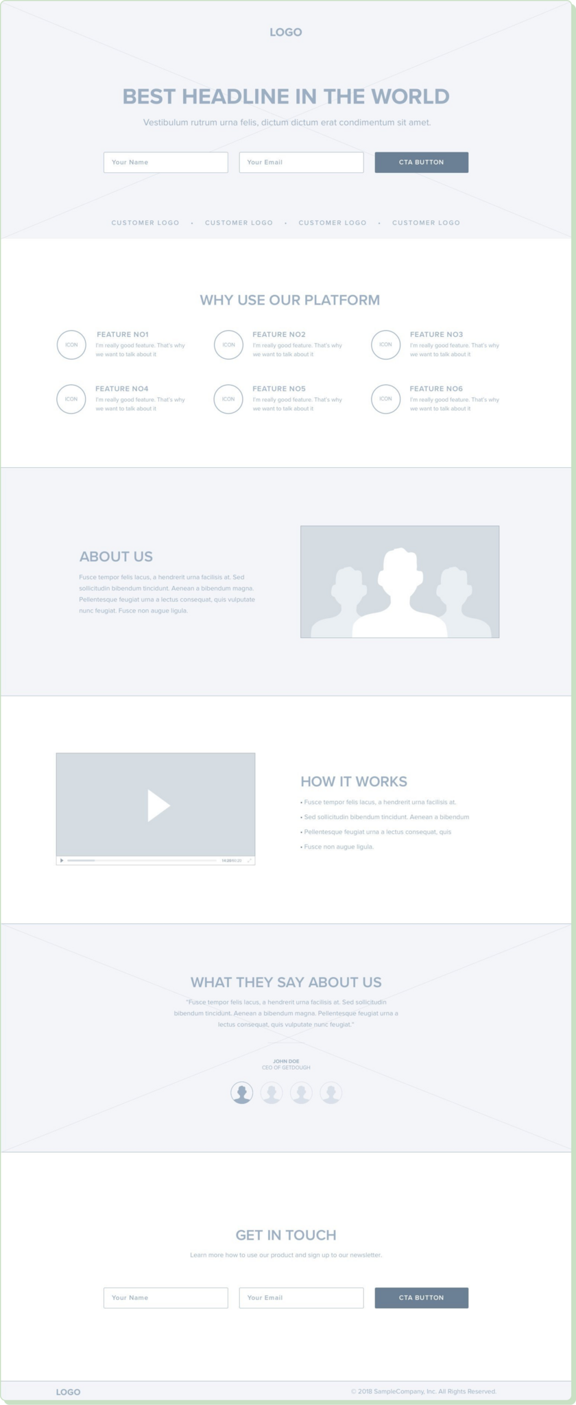
Wireframing is the creation of a basic visual webpage representation with no stylistic elements like colors, fonts, or images. It’s designed to outline the structure, layout, and functionality of a future page. It zooms in on what elements it will include and where they will be located.
Wireframing enables designers and developers to create the website’s architecture. It helps them prioritize content as well as user interactions without the distraction of visual design details.
This is how it contributes to the design and development processes.
- Wireframing provides a clear guide for what needs to be included on each page. This helps align the project team with the site's functionality and requirements.
- It bridges the communication gap between designers, developers, stakeholders, and clients. When everyone has a unified understanding of the project, fewer mistakes occur.
- It helps identify potential usability issues and necessary changes early on. This reduces the need for revisions during the later stages of development, which would only hinder the production process.
- It allows designers to focus on the user’s journey and the strategic placement of elements that guide users toward a specific action or outcome (signing up, making a purchase, requesting info, etc.).
When it comes to landing pages, wireframing bears an even more specific importance.
- Retaining visitors would be impossible without adequate wireframes. These help in strategically placing call-to-action buttons (CTAs), benefits, and testimonials.
- Wireframes help with testing and refinement. You can easily try out different layouts and elements to determine which configurations drive more conversions. Once repeated, this process can enhance the page's effectiveness before moving into high-fidelity designs.
In other words, wireframes help keep users engaged. By mapping out the user flow and interactions on the landing page, they ensure that the final design will be intuitive enough to keep visitors interested. Why? So that visitors move smoothly toward conversion.
This is how wireframing can increase landing page conversion rates.
- Consistent user experience (UX): Wireframing ensures that different screen sizes and devices benefit from the same high-quality UX. Because it puts the users first — especially mobile users — it can increase conversion rates due to its responsive design.
- Countless optimization tests: As previously mentioned, wireframes can be tested using real prospects. This is the best way to get insights into user behavior and preferences via A/B testing. You can test anything from CTA placement to headlines or content structure.
The differences between wireframes, mockups, and prototypes
Wireframes are the most basic visual representation of a website's or application's layout. Mockups include more details, such as colors, typography, and images. Prototypes are advanced, interactive demonstrations of a product’s functionality and design.
If we’re talking about purpose, wireframes are meant to set the basic structure of a page with no extra details. Mockups offer an overview of aesthetic and branding aspects. These include the color scheme, graphical elements, and text styles. Prototypes allow you to test and refine page functionality to identify usability issues. They provide a simulation of the final product.
How to build a wireframe for your landing page
Follow these steps to create a well-structured landing page wireframe.
1. Choose your tool
Before you start sketching your landing page, consider the pros and cons of digital and paper wireframing tools. A combination of both will provide the best results.
Digital tools
Pros
✅ Precision and flexibility : Digital tools allow for precise placement and adjustment of elements. They offer extensive flexibility in design iterations.
✅ Collaboration : Many digital wireframing tools support real-time collaboration. They enable teams to work together regardless of their location.
✅ Integration : Digital wireframes can be integrated into the broader design and development workflow. Most are also compatible with other design software and development frameworks.
✅ Reusable components : Digital tools support the use of symbols and reusable components. This can speed up the design process for multiple pages or projects.
Cons
❌ Learning curve : Many digital wireframing tools have a steep learning curve due to their extensive features and functionalities.
❌ Cost : While there are free tools available, many powerful options require a subscription or purchase.
❌ Overcomplication : The wealth of features and possibilities can lead to overcomplicated designs if not carefully managed.
Paper tools
Pros
✅ Accessibility : Paper wireframing is highly accessible. It requires only paper and pen without the need for any special software or skills.
✅ Rapid prototyping : It's quick and easy to sketch out ideas. This makes paper tools ideal for brainstorming and initial concept development.
✅ Focus on the basics : Paper wireframing focuses on the basic layout and content structure without getting distracted by design details or colors.
✅ Tactile experience : Some designers find the tactile experience of drawing on paper to be more conducive to creativity.
Cons
❌ Scalability issues : Paper wireframes are not easily scalable or adjustable. Changes often require redrawing the wireframe.
❌ No collaboration features : Unlike digital tools, paper wireframes don't support real-time collaboration or easy sharing. This makes them less ideal for remote or large teams.
❌ Limited interactivity : Paper cannot simulate interactivity or how the final product will behave in a browser or mobile device.
❌ Integration challenges : Moving from paper to digital format requires extra steps. There's no direct integration into further design and development processes.
2. Identify the goal of your landing page
Decide on what you want your landing page to achieve . Is it to generate leads, sell a product, or encourage sign-ups for a newsletter? This will guide the entire design process. It will also influence the content and design elements you include and how you prioritize them.
3. Map out user flow
Decide on what you want users to do when they land on the page. What would bring them closer to the conversion point? How should you design the layout to guide users in the desired direction? Consider the strategic placement of CTAs, information sections, and navigational cues.
4. Sketch the basic layout ideas
Explore different layouts using low-fidelity sketches . Use paper and pencil or a digital tool to quickly generate ideas without focusing on details.
5. Add the finishing touches
Include placeholders for images, videos, or icons that will support your message and attract attention .
☝️Make sure that CTA buttons are clearly visible , then combine main with secondary CTAs.
☝️Add placeholders for text, including headlines, subheadings, and body text.
☝️Focus more on where you will place the content rather than the final copy.
Best practices for landing page wireframing
These practices help elevate your landing page wireframing processes to excellence:
Understand your audience
To wireframe a landing page that resonates with your users, you need to find answers to the following questions.
❓What are your users looking for in your product/service?
❓Which problems do they need to solve, and which of their current needs still need to be met?
❓Which channels do they use to find information?
Once you’ve got this covered, decide on a tone for the copy you plan on using. Is your audience informal? Do they enjoy more formal or out-of-the-box visuals? The tone has to do with everything you place on the page, including branding elements and images.
Research your users
The main thing user research does is let you know how users prefer to take in content. It reveals their browsing habits, preferences, and more. This helps you make informed decisions on the structure of your landing page by considering the following aspects.
- Placing CTAs: Make sure you place your primary CTA above the fold (visible without scrolling). Place any additional CTAs right after an important piece of information. Make sure to include one at the bottom of your page as well. Remember to include attention-grabbing directional cues (arrows or images that draw attention).
- Simplifying navigation: Keep menu items to a minimum to reduce decision fatigue. Consider keeping them visible even when the user scrolls down a page (sticky navigation menus).
- Personalizing after segmentation: Leverage behavioral triggers like location, browsing history, or past user interactions to display personalized content. Test different content versions for different audience segments. That is how you see which performs best. Tools like Optimizely or VWO can facilitate this process.
- Leaving space for interactive elements: These can include chatbots, quizzes, or interactive demos. To simulate their behavior once the page goes live, use tools like Adobe XD, InVision, or Figma. Make sure load times don’t increase, as user engagement may drop. Choose effective media formats like WebP or MP4 to reduce file size to a minimum.
Maintain simplicity and clarity
Take into account minimalist design principles when wireframing your landing page.
☝️Make full use of negative space around critical page elements like CTAs and value propositions.
☝️ Set in place a clear visual hierarchy using size, color, and item placement.
☝️ Keep design to a minimum so that you cut out unnecessary distractions.
The CEO at GR0 explains why it’s so important to avoid distractions when wireframing landing pages:
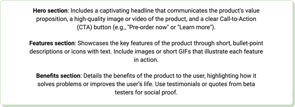
Focus on the core elements and functionalities of your product or service.
☝️Keep headline spaces short and leave space for persuasive testimonials.
☝️ Make sure not to overuse CTAs, as they would decrease in importance.
☝️ Keep menu options limited to the bare essentials.
Prioritize content hierarchy
Structure information to ensure a logical flow from entry to conversion.
☝️Map out your typical customer journey. This helps you understand exactly what users are looking for at each stage to move on to the next step towards conversion.
☝️ Place your value proposition content above the fold.
☝️ Make sure that each page section has its own descriptive, engaging heading.
Using visual hierarchy techniques is extremely beneficial in prioritizing content hierarchy.
☝️Aim to reduce cognitive load by using margins and padding to ease navigation.
☝️ Always keep related items close together to ensure information consistency.
☝️ Make sure that images contribute to your narrative without eclipsing it.
Consider responsive design
Plan your wireframe so that your landing page will look good on both mobile and desktop.
📲 Use a flexible grid layout that you can easily adapt to fit different screen sizes. This way, you’ll deliver your message using the same quality across all devices.
📲 Make sure that interactive elements like forms or sliders will be responsive during touch interaction.
📲 Only use images that adjust in size based on different screen resolutions. Use cascading style sheets (CSSs) or fluid images.
Use iterative design and feedback
An iterative or repetitive design makes room for change and innovation.
🛠️ Tools like Figma, Sketch, or Adobe XD make it easier to get feedback from anyone involved in creating the landing page. They also support collaborative design.
🛠️ These tools can create interactive prototypes that will give you a hint of what to change for your final product if need be.
Ensure accessibility
Design your wireframe so that your landing page will cater to all users once it’s live.
♿ To create inclusive digital experiences, look into the Web Content Accessibility Guidelines (WCAG). Among others, they state that a contrast ratio of at least 4.5:1 is ideal for normal text and 3:1 for large text.
♿ Make sure that keyboard navigation is supported for people who can’t use a mouse. You can do that by including focus indicators.
♿ Cater to users with hearing or visual impairments by including captions, transcripts, and audio descriptions.
Three landing page wireframe templates
Templates help streamline the design process. They can accelerate the wireframing context by providing a basic structure you can improve upon.
We've created three templates to help you build your own landing page for various business situations. We’ve also included some tips to help you customize them as you see fit.
1. Service subscription landing page wireframe template
2. Product launch landing page wireframe template
3. Event registration landing page wireframe template
Three landing page wireframe examples
We've selected three brilliant wireframe examples to inspire you.
Figma
Image source: figma.com
What makes it stand out
- Trust-reinforcing sections : The combination of statistics, testimonials, and reasons why clients place their trust in the company makes prospects want to try out the product. Social proof is also covered.
- Visual symmetry and balance: The text-to-image ratio is optimal. Users won’t get overwhelmed by too much text or get distracted by elements that stand out too much. There is just enough whitespace around essential elements to avoid clutter, which makes the page easy to read and navigate.
- Engaging elements: The frequently asked question section urges users to find answers to questions they are considering themselves. The blog preview section is also engaging, as readers may be interested in browsing through the latest posts. It positions the company as an industry authority.
Unbounce
Image source: unbounce.com
What makes it stand out
- Conversion-focused elements: It’s clear right from the start that this wireframe was created with one goal in mind — to convert visitors. CTA placement, content section layout, and the action-oriented design contribute to that.
- Orientation to detail: Nothing in this wireframe has been left to chance. Quotes, images, and social proof elements are part of a carefully executed design that aims to boost trust and engage visitors.
- Testing possibilities: The entire structure is compatible with A/B testing, as it is easily adaptable. It follows a logical informational layout based on further engaging the user. The page structure promotes a distraction-less journey toward conversion.
Instapage
Image source: instapage.com
What makes it stand out
- User-centric structure: The wireframe follows a logical flow, starting with the headline and ending with social proof. White space is distributed evenly, helping users focus on crucial elements. Multimedia content engages them even more.
- Brand credibility: The "About Us" section helps create a more personal connection with the brand by telling the company’s story. Aside from building brand identity, it helps make the people behind the brand more trustworthy.
- Responsive design structure: The way the wireframe is organized suggests that it would adapt well to multiple screen sizes. The easily stackable elements will maintain their integrity in a horizontal format, prevents user frustration and possible drop-off.
Mistakes to avoid when wireframing your landing page
Completely skipping wireframing
When you go directly to high-fidelity designs, you risk adding extra costs to your project. How? By completely altering the structure of your page in case results aren’t as expected.
Making changes during the wireframing stage is much less costly and doesn’t need complex revisions. It helps identify and correct problems early on, which leads to cost and time savings .
☝️Help stakeholders understand this. Try pointing out real-life examples of companies that used wireframing to reach their desired product goals.
☝️ Focus on tools that allow for rapid prototyping. This will help accelerate the production pace, as people will get a chance to test user flows and layouts early on. Sketch, Figma, and Marvel are some tools that provide prototyping functionalities.
Not testing wireframes
Testing wireframes secures stakeholder buy-in. You won't make it past the creative stage without the funds and support needed to create the ultimate landing page.
Here are some simple methods for testing and gathering feedback on your wireframe.
📝 Organize user testing sessions. Invite a small group of people with similar features to your target audience (same age group, consumer preferences, etc.) and ask them to perform certain tasks. For instance, they should try to complete a sign-up process on your existing wireframe.
📝 Conduct surveys and questionnaires. You don’t have to create them yourself. Use tools like SurveyMonkey or Google Forms to ask targeted questions. The questions can be about usability, design, content, and UX. Include a broader audience in your surveys to collect more diversified feedback.
Not considering technical limitations
We’ve already talked about leaving space for interactive elements on your landing page. However, you should only do it if it doesn’t have a negative impact on site loading time.
If you ignore the technical limitations of your page, you risk Google ranking penalties, poor UX, and reduced conversion rates. All are correlated with poor page speed, not to mention added production costs due to extensive revisions.
To mitigate those risks, start by defining your goals. What is your maximum page load time? Make sure everyone is on board with this, then optimize your wireframe .
⚙️ Use compression tools to reduce image size and video file size for the elements you will include.
⚙️ Reduce HTTP-dependent elements on your page (scripts, images, etc.).
⚙️ Use content delivery networks (CDNs) to evenly distribute content across multiple servers, worldwide.
If you’re wondering what needs tweaking, use the following tools to access page performance insights:
- Google PageSpeed Insights
- Lighthouse
- WebPageTest
Neglecting branding guidelines
There are certain risks of not aligning with branding and design guidelines. For example, a confusing page layout can lead to a poor UX. If sections don’t align with your brand identity, it can seriously affect your credibility and reputation.
Your target audience may be less engaged by your page as a result of brand inconsistency. This can lead to lower conversion rates, as your unique selling point and brand values do not get through to your visitors.
Fortunately, there are solutions for ensuring alignment with design and branding
strategy.
🎨 Incorporate and reinforce branding guidelines. Set rules for logo usage and decide on a color scheme, typography, imagery, and voice. To ensure everyone is on board, create a checklist for every step of the wireframing process.
🎨 Centralize your branding resources. Create and maintain a branding library with your vetted assets (logos, color schemes, font files, images). This facilitates access for designers and helps maintain brand consistency.
Best digital landing page wireframing tools
This is our selection of the top wireframing tools.
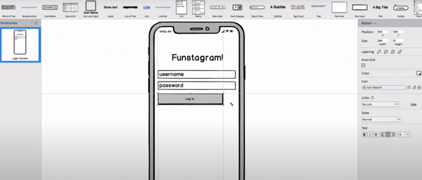
Balsamiq
The platform offers a user-friendly interface. It has drag-and-drop elements, ideal for those new to wireframing. It's great for low-fidelity wireframes that focus on layout and UX. Its flexible digital editing functionalities promote simplicity and fast prototyping.
Image source: balsamiq.com
Limitations
- May not be suitable for projects that need high-fidelity prototypes with detailed interactions and visuals.
- May lack the advanced design features found in more comprehensive UX/UI tools.
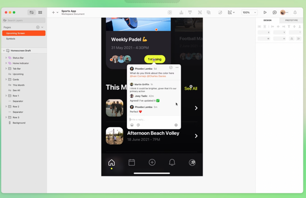
Sketch
Sketch is a vector-based design tool. It is popular for its simplicity and effectiveness in wireframing and high-fidelity designs. It offers a wide range of plugins for added functionality. It works for both initial wireframing and advanced prototyping, incorporating extensive collaboration features.
Image source: sketch.com
Limitations
- The broad range of features may present a steeper learning curve for newcomers.
- Access to the full suite of features requires a paid subscription, which may be a downside for individual users or small teams.
Adobe XD
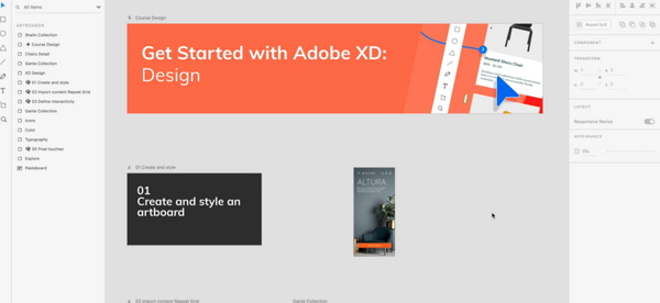
Adobe XD is a powerful tool. It is designed for wireframing, prototyping, and designing user interfaces for web and mobile apps. As part of the Adobe Creative Cloud suite, it offers a range of features for detailed and interactive wireframes.
Image source: helpx.adobe.com
Limitations
- The wide range of features can be overwhelming for beginners.
- It is part of the Adobe Creative Cloud subscription, which might be expensive for some users.
Voog
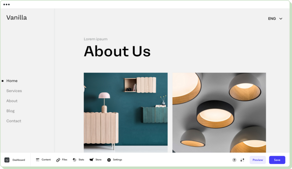
Voog is a website builder. It offers simplicity and ease of use for creating beautiful websites, including landing pages. Its intuitive design interface allows for quick layout planning and prototyping.
Limitations
- May lack advanced wireframing features like user flowcharts or interactive elements specific to wireframing.
- While it offers a free trial, full features require a subscription.
Let your website builder take on the burden
Ready to transform your landing page wireframe into a stunning, functional website? Let our website builder do the work for you. Allow it to bridge the gap between ideas and results while you focus on aligning every member of your team with the project’s vision.
As the web design and UX landscape evolves, you need to explore the freshest wireframing techniques. Refine your approach using the newest techniques and keep an eye on the latest industry news by staying tuned to our dedicated blog.
Planning a new landing page, revamping an existing site, or exploring a new app idea? Start working on your next landing page project today!
